I have been a designer for 40 years. My aesthetic has always centered on timeless interiors. I am the first one to want to be “up to the minute” but there is a way to do it and there is a way to avoid.
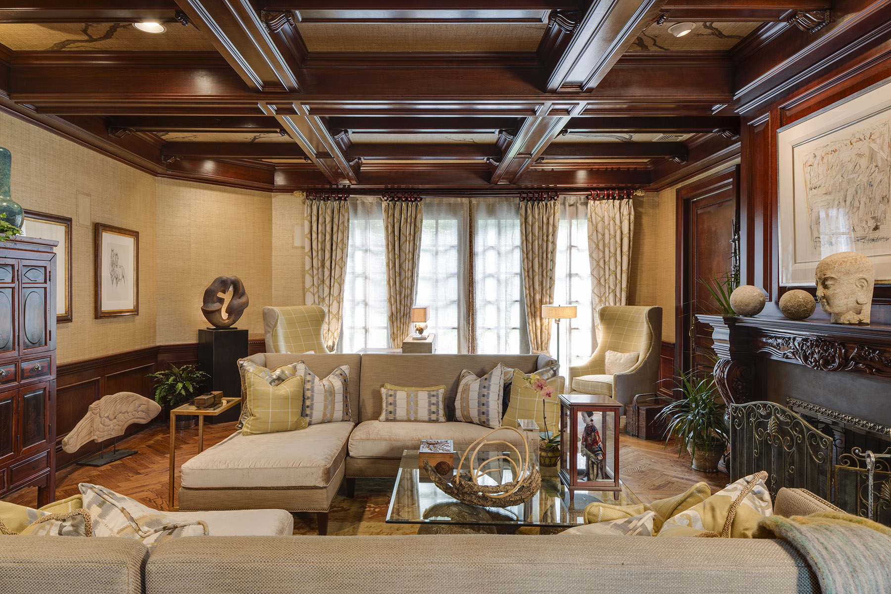
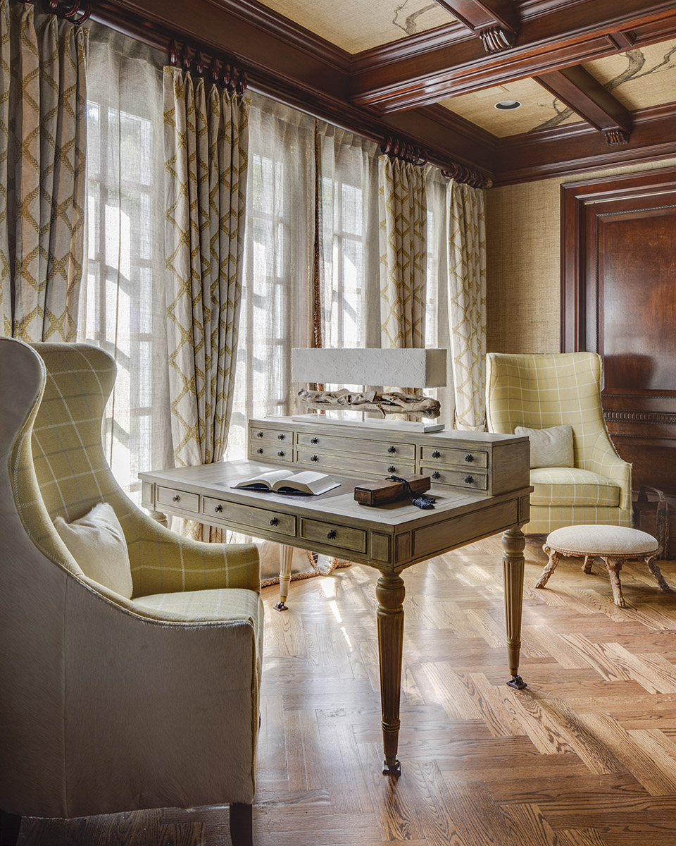
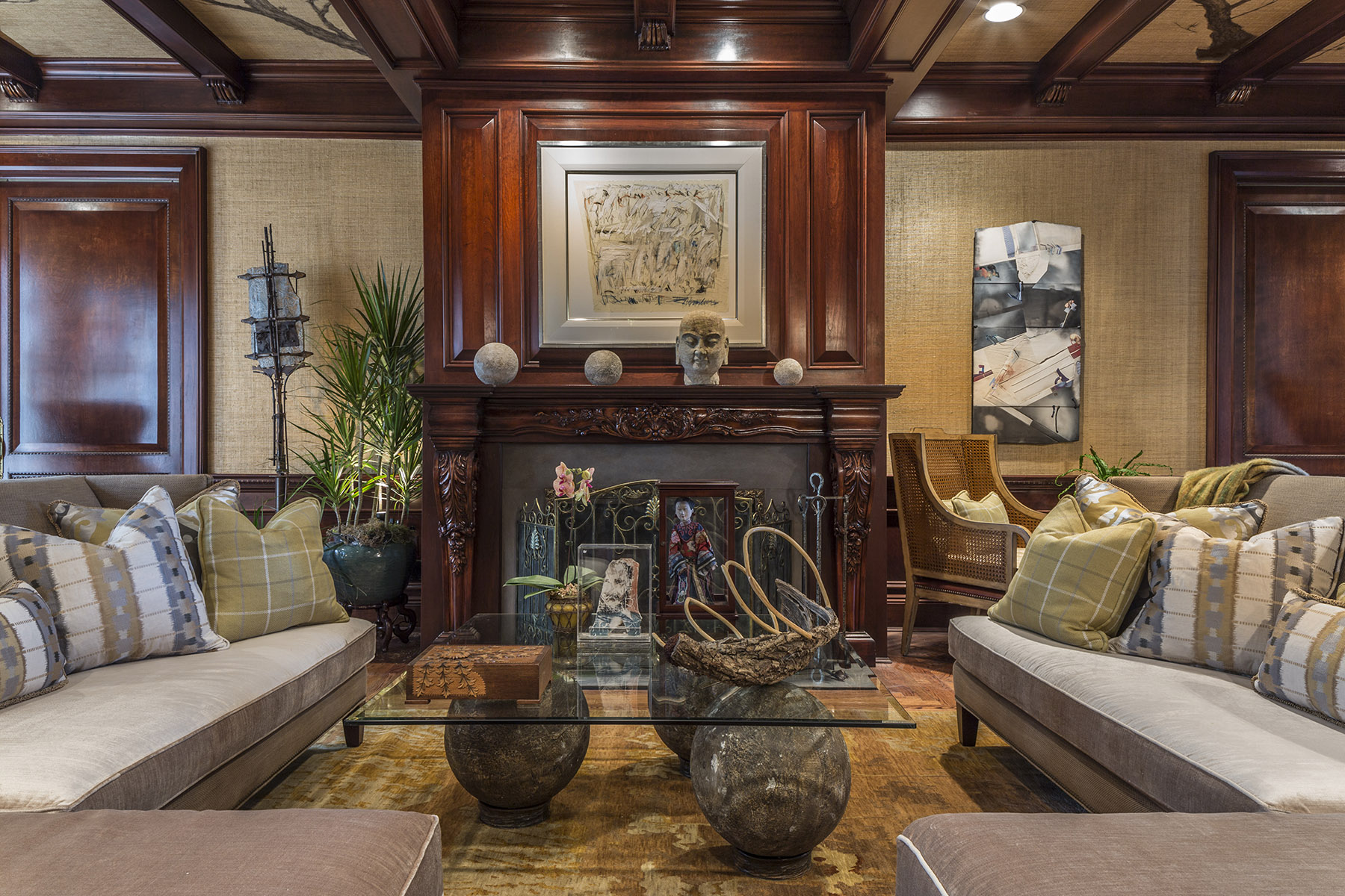
The way to do it is to look at the silhouettes of current furniture and select calmer less extreme designs. Our Designer Show house Living Room is a case in point. I have done a traditional room clearly, but the shapes of the upholstery are clearly contemporary.
How it works is that the silhouettes are strong and simple and allude to the architecture that is established. Unless you are blowing up the space, architecture plays a very important role in the successful interpretation of any home’s interior. After all, you bought the house based on several criteria, architecture being one of them.
I know that great design is an investment. I am not afraid of that. You should not be either. Timeless interiors and great design lasts. Done right, timeless interior design will return enjoyment year after year – long after pain of the cost is absorbed.
But time and time again, I visit homes and interview clients that have worked with previous professionals and what I see is a banal selection of furniture that gets placed in a room without thought to the overall canvas that they are creating and the longevity of the result. Each piece is from nice to spectacular with no regard to how it integrates into the overall of the use of the space and the look of the “canvas”. So instead of the result being a wonderful environment, what you get is a “room filled with furniture”.
When I face these issues, my heart goes out to the client as they have put their trust into the professional that they have hired to guide them correctly. If they hire me, my first job is to interpret the design of the space in which it was supposed to be based on what client’s needs, desires, and selections. Then I purge the spaces of extraneous pieces that do not get us to that goal. I then salvage and redistribute the existing pieces. I then design the new backgrounds that make it all work. Subtle shifts in mood from room to room create excitement and energy that a house needs to be interesting.
Rooms should be a combination of their own personality while relating to the whole….this is mostly missed by some professionals. So what you get is a bland environment, room after room that does not change mood or intensity and winds up being boring.
Just recently my work was featured in 201 Magazine, the October 2015 issue. It is a project that I had completed 12 years ago and was photographed 10 years ago. That is the true testament to “timeless design”. I create nothing less and you should expect nothing less.
To read more about the project featured in 201 Magazine, read here.


